


While it may seem trivial, choosing the right colors for your office is crucial . It's not just about aesthetics and decoration, but a real strategic lever for improving employee well-being, concentration, and productivity . Colors also serve to convey a message , reflect your company's values , and strengthen your brand identity .
Stimulating shades for motivation or sober hues for concentration, here are our tips for creating the ideal color palette for your office .
Why do colours have an impact in the office?
Colors have an impact on the performance and mood of workers . When chosen well, they transform a neutral space into an inspiring and motivating office .
The psychology of colors

Color psychology is the study of this impact. This early 20th-century discipline, developed notably by Carl Jung and Wassily Kandinsky, theorizes the influence of colors on human behavior, emotions, and decisions .
Each hue possesses specific properties and triggers a different psychological and physiological response . In general, cool colors evoke calm, concentration, and balance, while warm tones promote energy, creativity, and passion. Neutral tones, on the other hand, appear cold when used alone but bring structure and clarity when combined with other colors.
Understanding the language of color allows you to adapt your space to your needs . In the professional environment, the influence of color is particularly significant. 70% of employees say that the colors of their office impact their motivation, and 62% feel more motivated in colorful workspaces.
The neuroscientific approach to colored environments
The reason each color affects individuals differently is that the brain does not process all color information in the same way . For example, red stimulates the left hemisphere, responsible for rigor and productivity, while blue activates the right hemisphere, linked to creativity.
This scientific approach is called neuroscience applied to design or neurodesign .
Effects on mood and productivity
Colors are therefore far from being mere decorative elements, but influence performance and inspiration, particularly in professional environments.
When properly dosed and chosen, they can positively affect mood, motivation, productivity, concentration and creativity .
Colors have an effect on several physiological and psychological levels:
- Physiological impact: Certain colors, like red, accelerate the heart rate and elicit a strong physical response, while cool colors like blue decrease the pulse, blood pressure, and respiratory rate, and stimulate the parasympathetic nervous system, which relieves stress. Furthermore, colors influence the temperature and acoustic atmosphere of a room . In fact, there are acoustic paints that absorb sound, ideal for open-plan offices.
- Psychological impact: Warm colors send a motivating and energetic signal, while cool tones evoke calm and harmony.
- Impact on performance and cognitive function: Several studies demonstrate the impact of color on creativity, motivation, and productivity. Recent studies show that people working in colorful environments are up to 30% more productive than those working in plain, drab spaces.
The psychology of colors should be considered a major asset by companies wishing to optimize the well-being and efficiency of their employees.
Colors and their effects in the office
Each color therefore possesses different virtues which we decipher here in order to choose the right combination.
Cool colors: for greater serenity and concentration
Blue: concentration and calm

According to color psychology, blue inspires confidence and serenity . In fact, 33% of technology companies have adopted it in their branding. It is also highly valued in the financial and legal sectors, as it evokes professionalism and reliability .
Touches of blue in a workspace promote calm, concentration, and intellectual reflection . This color is therefore particularly suitable for offices requiring intellectual, analytical, or collaborative activities, especially for areas of concentration and intensive work, as well as for meeting rooms.
Blue is also a color that encourages creativity. It helps develop imagination, innovation, and creativity . That's why it's recommended for creative professions such as architecture, graphic design, or communication.
By activating the parasympathetic nervous system, blue relieves stress, which is particularly valuable in a professional context.
While blue can appear cold in its darkest shades, it can warm up natural materials like wood. In lighter shades, it brings brightness to an office.
Green: balance and serenity

Inspired by nature, green reduces stress and promotes serenity. Soothing and relaxing , it significantly reduces eye strain. It also aids learning, memory, concentration, creativity, and emotional balance .
This color is ideal for open-plan offices, relaxation areas, and concentration zones. Combined with natural materials and plants, it creates a green and inviting atmosphere.
Conveying a concept of well-being, it is highly valued in the medical and environmental sectors.
Violet: calm and creativity
Purple possesses virtues similar to blue , such as calmness and concentration. Conducive to the imagination, it allows the mind to wander and develops creativity and reflection while maintaining a serene environment.
Combining the tranquility of blue with the passion of red, this color is particularly suited to creative professions and spaces requiring innovation and deep reflection.
Warm colors: energy and stimulation
Red: dynamism and productivity

Stimulating and powerful , red boosts physical energy and productivity because it awakens the left hemisphere of the brain and elicits a significant physical response. This color embodies boldness . It motivates action and enhances performance.
Often associated with passion, red is particularly suitable for physical and competitive activities, such as coaches, salespeople or manual laborers.
Despite all these virtues, it should be used sparingly , otherwise it risks becoming too overwhelming and causing stress and agitation. Combining it with white helps to soften its intensity.
For example, it can be used in passageways or as an accent to attract attention.
Yellow and orange: creativity and energy
Bright and energetic , yellow and orange stimulate creativity, imagination, and intellect . They promote concentration and decision-making .
In their most vibrant shades, these colors have a "vitamin effect" and act as a wake-up call for both body and mind. Their antidepressant effect helps to increase the dynamism, enthusiasm, and optimism of employees .
These colors are best reserved for meeting and brainstorming rooms, reception areas, collaborative spaces, or offices requiring communication and recreational activities. They should be used in a balanced way, combined with white or dark gray, to minimize eye strain.
Rose: Stress reduction and positive emotions

Pink activates positive emotions and reduces stress . It is particularly suitable for relaxation areas and offices requiring a relaxed atmosphere.
Neutrals: stability and structure
White: light and space, but beware of coldness

Simple and clear , white embodies minimalism, clarity, and purity . In addition to stimulating concentration, it makes spaces appear brighter and more spacious .
However, too much white can appear cold and impersonal , which can hinder employee motivation and engagement. Therefore, it needs to be balanced with other colors to create a warm and inviting environment.
Beige and natural tones: comfort and timelessness

Beige and neutral tones , such as earthy colors, are timeless and bring comfort and stability . They create serene, stress-free environments .
They provide an excellent base for incorporating more colorful and dynamic accents.
Black and dark grey: elegance and authority, but beware of heaviness.

Black and dark grey are synonymous with elegance, sophistication, and authority . This is why many luxury brands, such as Chanel and Gucci, incorporate them into their visual identity.
Using these colours for your office requires combining them with lighter shades to avoid heaviness and overly dark interiors.
How to choose the right colors for your office?
There is no precise rule for determining the most suitable colors for an office. The choice depends on many criteria, such as the company's identity, the lighting, the size and layout of the offices, and the type of activity.
Depending on the type of activity
Choosing the colour(s) for your office should be done according to the type of activity .
For example, one could opt for light or medium shades of blue for intellectual work, while yellow and orange would be preferred for creative spaces.
Each sector of activity has its own color codes :
- Technology: Blue is the distinctive color of technology companies, as it is a sign of reliability and innovation.
- Communication and multimedia: warm tones and bright colors are particularly appreciated by the sector, as they symbolize dynamism and innovation.
- Banks and insurance companies: blue, black and grey are often preferred for trust and stability.
- Food industry: green, yellow, and orange are common choices because they evoke the natural colors of food. They suggest freshness and naturalness.
- Environment: naturally green!
- Health: green and light blue are preferred, as they convey a feeling of trust, professionalism and cleanliness.
- Construction: blue, grey and brown are often used in the construction field because they evoke solidity, robustness and reliability.
- Fashion and aesthetics: white, pastel and natural shades, synonymous with femininity and well-being, are often used in these feminine worlds.
- Studies, advice and training: blue, green and purple are common choices because they inspire knowledge, confidence and wisdom.
Depending on the spaces
The choice of colours also depends on the purpose of the spaces :
- Concentration areas and individual offices: cool colors (blue, green and purple),
- Creative and collaborative spaces: bright and stimulating colors, such as orange and yellow,
- Relaxation areas: soft tones, such as sage green, lavender or pale pink,
- Reception areas: warm colors such as natural tones, yellow and orange.
- Meeting rooms: neutral colors with bright accents, such as grey with touches of red or orange.
Color can also be used to facilitate orientation , by designating a specific color to distinguish different areas and make navigation more intuitive.
Depending on the light and materials

The perception of colors changes depending on the brightness of the room and the materials with which they are associated.
Indeed, a color doesn't react the same way under cold fluorescent lighting, warm lighting, or natural light. Ideally, you should test the color in situ using samples. Generally speaking, poorly lit or poorly exposed spaces benefit from light, warm, and luminous tones, such as beige, yellow, and soft orange.
Combining colors with natural materials, such as wood, rattan, or textiles, tends to soften contrasts and create a harmonious atmosphere. Cooler materials, like metal, can, on the other hand, make colors and the environment feel cold.
Depending on the layout, available area and volume
Some colors tend to make a space appear larger, while others make it appear smaller. Therefore, when choosing colors for your office, you should pay attention to its layout, size, and volume .
In small spaces or dimly lit areas, it's best to opt for light and neutral shades to brighten and enlarge the room. Darker colors are more suitable for larger spaces, as they create a more intimate feel.
According to brand image

Colors reflect the company's visual identity . More than 80% of consumers admit to buying products based on their color.
This information is crucial for your branding and graphic charter , which can be subtly incorporated throughout your office for greater visual consistency and to reinforce your brand image.
This question of consistency is paramount to facilitate brand identification at a glance. For example, Coca-Cola reports a 45% increase in sales since the brand introduced red into its advertising.
Ideas and inspiration for color combinations
Harmonious palettes

The combination of colors is just as important as the individual choice of colors. While the latter is based on concrete criteria and color psychology, creating a harmonious palette requires the use of Itten's color wheel (or color circle) and the 60-30-10 rule . This rule consists of combining a dominant neutral color (60%), a secondary color (30%), and a colorful accent (10%) to ensure visual balance without overloading the space .

Here are some examples of harmonious color palettes to use depending on your sector and image:
- Natural palette: combine sage green with beige tones and touches of terracotta. This combination promotes a connection with nature and reduces stress.
- Technological palette: use blue as a base to combine with grey and a few white accents for a professional and innovative environment.
- Creative palette: mix soft yellow with warm neutral tones and a few touches of orange to stimulate creativity.
Decor styles and trends for 2025
The choice of colors is part of a broader design concept . As such, you can draw inspiration from decorating styles and trends for 2025 .
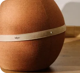
Scandinavian style creates a soft and welcoming atmosphere by combining light, natural hues, such as white or beige with touches of sage green or soft blue, and natural materials like light wood or rattan. This minimalist style promotes concentration and serenity. Our Bloon Original, Bouclette , or Cordé ball chair fits perfectly into this type of decor.

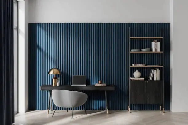
The industrial style , while cooler, is also suitable for interior design in workspaces. It combines dark colors, such as gray and black, with accents of bright colors, such as copper or brick red, and metal furniture.
Incorporating color without repainting everything

To incorporate color into your office sparingly , opt for color accents rather than total saturation.
Instead of repainting everything, you can add small touches of color through furniture and decorative accessories . This solution is more flexible, easy, and immediate to implement.
In terms of furniture, you can opt for colorful shelves or seating. Bloon ergonomic chairs, for example, come in a wide range of colors and materials to suit all styles and reflect your company's image.
Decorative accessories are also a great way to add color to your office, for example, with lamps, rugs, cushions, wall art, or even plants. They allow you to introduce colorful accents temporarily and affordably. This solution is particularly useful in rented spaces where you don't want to invest a lot.
Finally, modern technical solutions, such as decorative stickers, masking tape or mobile partitions, now exist to quickly change the look and layout of your office.
Mistakes to avoid when decorating your office
As you will have understood, when it comes to adding color to your office or any other interior, the key words are restraint and harmony .
Too many bright colors
Avoid excessive use of bright colors, which can be tiring and distracting. Color overload creates confusion and eye strain. It can damage your professionalism and credibility by giving the impression of a chaotic atmosphere.
A space that is too neutral or too dark
Conversely, a space that is too neutral or too dark , dominated by white, gray, or black, creates a cold and dreary atmosphere. These neutral and achromatic colors , when they predominate, do not evoke any positive emotions and are detrimental to employee morale. In addition to harming employee energy and motivation, completely white walls increase the risk of burnout. Yet, in France, nearly 8 out of 10 workplaces are white.
Even in a minimalist style, it is possible to integrate strategic touches of color, for example, through decoration and furniture.
Lack of consistency between the colors
Finally, avoid using too many colors and combining them randomly. A lack of consistency in the choice of color palette creates a cluttered atmosphere.
Limit yourself to 2 to 3 colours using the 60-30-10 rule. Reserve bright colours for accents and areas of stimulation such as collaborative spaces.
Do not neglect the importance of lighting, which can alter the perception of colors.
When decorating individual offices, also consider consulting your employees, as we all react differently to colors.
Don't go overboard and don't try to make everything uniform. While you want to convey the company's values and brand image, you need to vary the atmospheres according to the functions of the different spaces.
Conclusion
In the office , colors not only shape the environment, but also influence well-being and performance . When chosen carefully, they transform your workspaces into sources of inspiration and productivity.